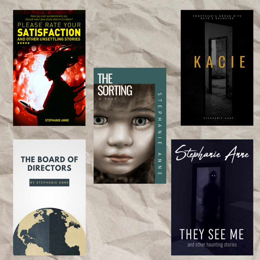
Despite the tired old saying “don’t judge a book by its cover”, I know I can’t be the only person out there who routinely ignores this advice. And everything I’ve learned about the publishing and self-publishing industry supports this. The cover is arguably one of the most important parts of the book because it’s what entices readers to take a look inside. It sets an expectation, makes a promise. I remember when I showed Mark the cover of The Sorting and he said, “It looks like a play.” “Perfect!” I said, because a play is exactly what that story is.
When it’s time for me to choose a cover, my first goal is to pick something that reminds me of the story/stories within the book. When I worked with Bea Reis Custodio for Please Rate Your Satisfaction and Emily Bain for They See Me, they both sent me multiple potential covers to choose from. It’s very difficult in those early moments of excitement when I see things I like in all the options. This is when I need to take the time to slow down, turn on the logic part of my brain, and figure out which ones remind me of what I’ve written. After some thought, I can usually narrow my choices down to a top two. But the decision making does not stop there.
More important than how I feel about the covers is how other people feel – specifically, my readers. I may love a specific cover that is not the right fit for the book, so it’s helpful to get a second, third, and fourth opinion. Beta readers are a significant group of people who I can turn to for help, because they’ve read the stories and will have their own ideas about what would make a good cover. Newsletter subscribers are also helpful because they have read my past work and are interested in reading what I write in the future. They are a part of my target audience, so the goal is to pick a cover that appeals to people like them. And speaking of my target audience, I am lucky enough to have two close friends who not only beta read for me, but who are also a part of my key demographic. When they tell me which cover they like the best, that’s enough to sway any ideas I may have.
But there’s a third step to my cover selection process that I find incredibly useful. I am lucky enough to have a husband who is colourblind. Throughout our relationship, I have learned that I shouldn’t always use colour to describe an object. And I have learned that, sometimes, things like videogames don’t take into account colourblindness when designing puzzles. So naturally, when I start cover shopping I want to to show every single option to my husband. There was one potential cover for Please Rate Your Satisfaction that I really liked, but when Mark looked at it he struggled to see a difference between the colour of the text and the background. Trying to take accessibility into account is important. And although a relatively new indie author like myself can’t afford the expenses associated with things like audiobooks, making sure my covers are accessible for colourblind readers is free and easy to do.

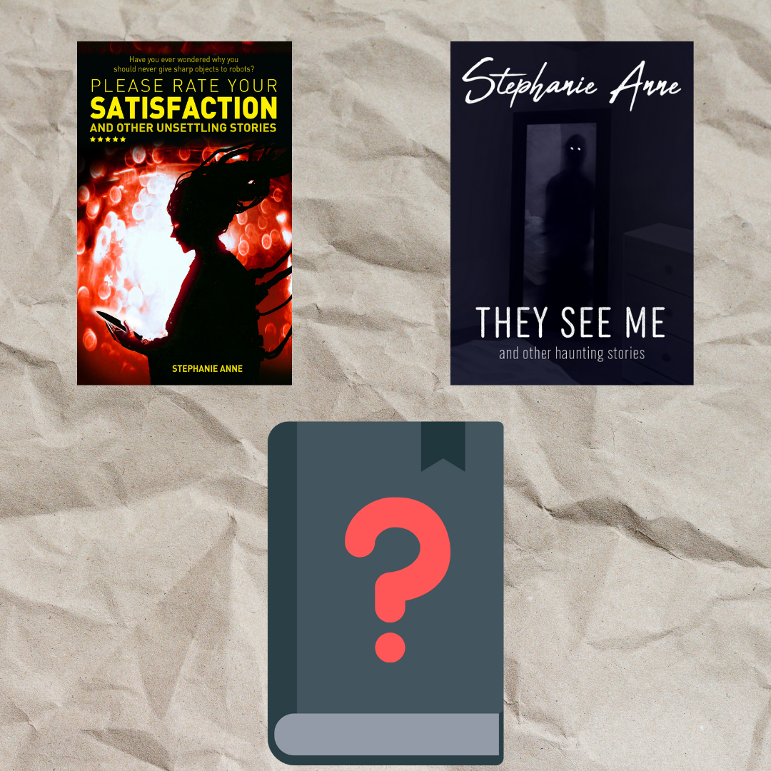
Now that I’ve shared my cover selection process, I’m pleased to announce that I have started cover shopping for Re-Awakening and Other Disturbing Stories. As beta reader feedback is trickling in, and the next phase of editing is starting up, I’m collecting the opinions of my target audience, friends, and colourblind husband to help me pick the best cover. And, of course, I’ve found a cover I like that reminds me of the stories within the collection.
Remember, if you want an exclusive sneak peek of this cover before anyone else, sign up to my newsletter. I hope to have something to show off in April.
Happy Reading!